Data storytelling appears in many places and in many forms, which can be confusing. In this article, we'll help you better understand why it matters, using the AutoPi device as a practical example.
Finally, we'll show you how to create your own data story to support smarter, data-driven decisions.
What is Data Storytelling?
Data storytelling is the ability to explain insights from datasets using narratives and visuals. It helps contextualize findings and drive action.
This approach is used across various industries to solve challenges—such as visualizing optimization opportunities in fleet management.
The story helps explain what the data means and why it matters.
Data allows us to spot patterns and gain insights that might otherwise be missed. For instance, by analyzing data from your electric vehicle, you can evaluate its performance and monitor its health.
It's important to remember that raw numbers alone aren’t meaningful. Data needs context to be understood—which is why big data must be translated into actionable insights.
Telling a story with data helps your team go from point A to point B.
Data Storytelling Through AutoPi
In this article, you'll learn how the AutoPi IoT platform functions and how it can help you make better data-driven decisions.
The analysis process consists of three steps—extracting, organizing, and visualizing data, all performed by the AutoPi device.
The final step—telling a story with the data—is where data storytelling comes into play. Dashboards help you communicate insights visually, enabling effective decisions.
In this workflow, we gather as much data as needed, prioritize it, and apply criteria for optimization.
Note: Our open data pipeline gives clients full control over how and where data flows. In this example, we assume the data is sent to the AutoPi Cloud.
Keep reading to discover how AutoPi enables data storytelling.
Step 1) Extracting Data

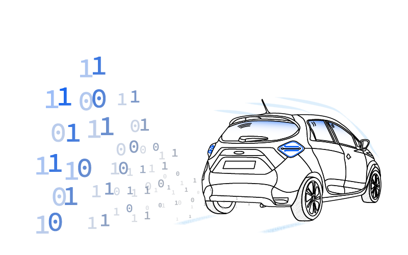
Every time your vehicle’s engine turns on, the CAN bus system allows various Electronic Control Units (ECUs) to communicate. Vehicles can contain up to 70 ECUs.
For example, ECUs manage the battery, engine, airbags, and more.
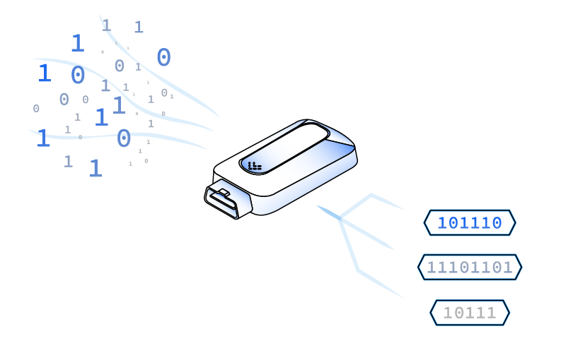
Think of the vehicle as a human body: the CAN bus is the nervous system, and ECUs are the organs. AutoPi listens in and logs the data in real time.
Step 2) Sort & Arrange the Data

The logged data is time-stamped in real time but initially remains a raw dataset.
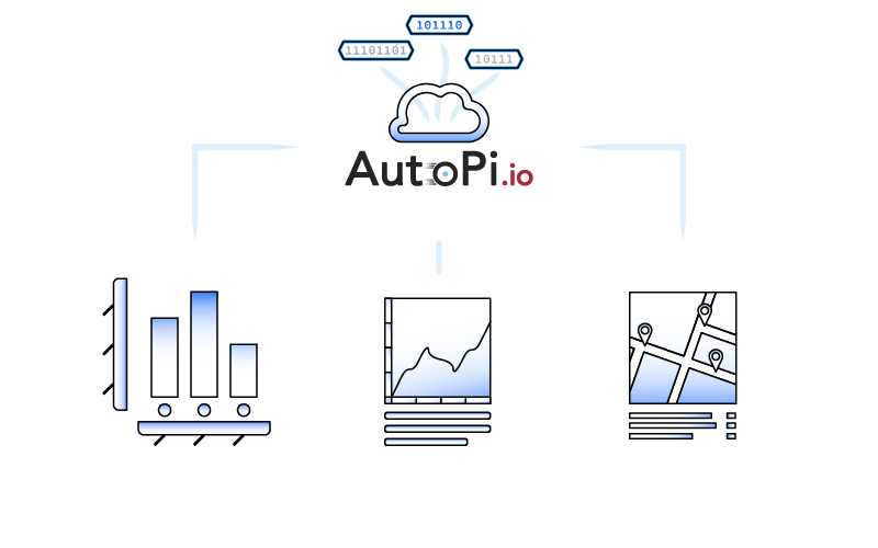
Raw data alone isn't useful. The device automatically processes it by sorting, arranging, and filtering based on predefined loggers in the AutoPi Cloud.
For more details, visit our documentation site.
Step 3) Visually Present the Data

With large amounts of data collected from your vehicle, it's essential to tell a story in order to interpret it effectively.
As the vehicle data flows through the system, it’s visualized in the AutoPi Cloud via maps, graphs, tables, and more—enabling clear insights.
Step 4) Explain the Data With a Story

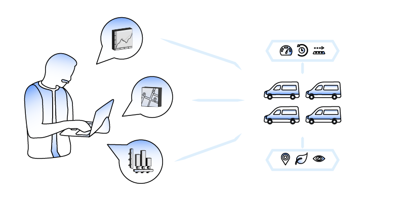
Visualizations make data easier to understand, but the real value lies in connecting insights to tell a story. This helps assess fleet performance and take action.
Through storytelling, you’ll identify trends, patterns, and outliers across your fleet.
The AutoPi Management Cloud provides a comprehensive dashboard—including trip counts, mileage, fuel usage, idle time, and driving behavior.
These insights can be used to:
- Ensure operational efficiency to maximize fleet potential.
- Monitor financial management and understand total cost of ownership and ROI.
- Improve vehicle health by integrating data into maintenance programs.
- Discover optimization opportunities that increase efficiency and reduce costs.
Want to learn more? Contact us at autopi@sales.io or visit AutoPi.io.


